MACO Financial Services
Crafting Creative and Agile Branding for a Fin-Tech Firm
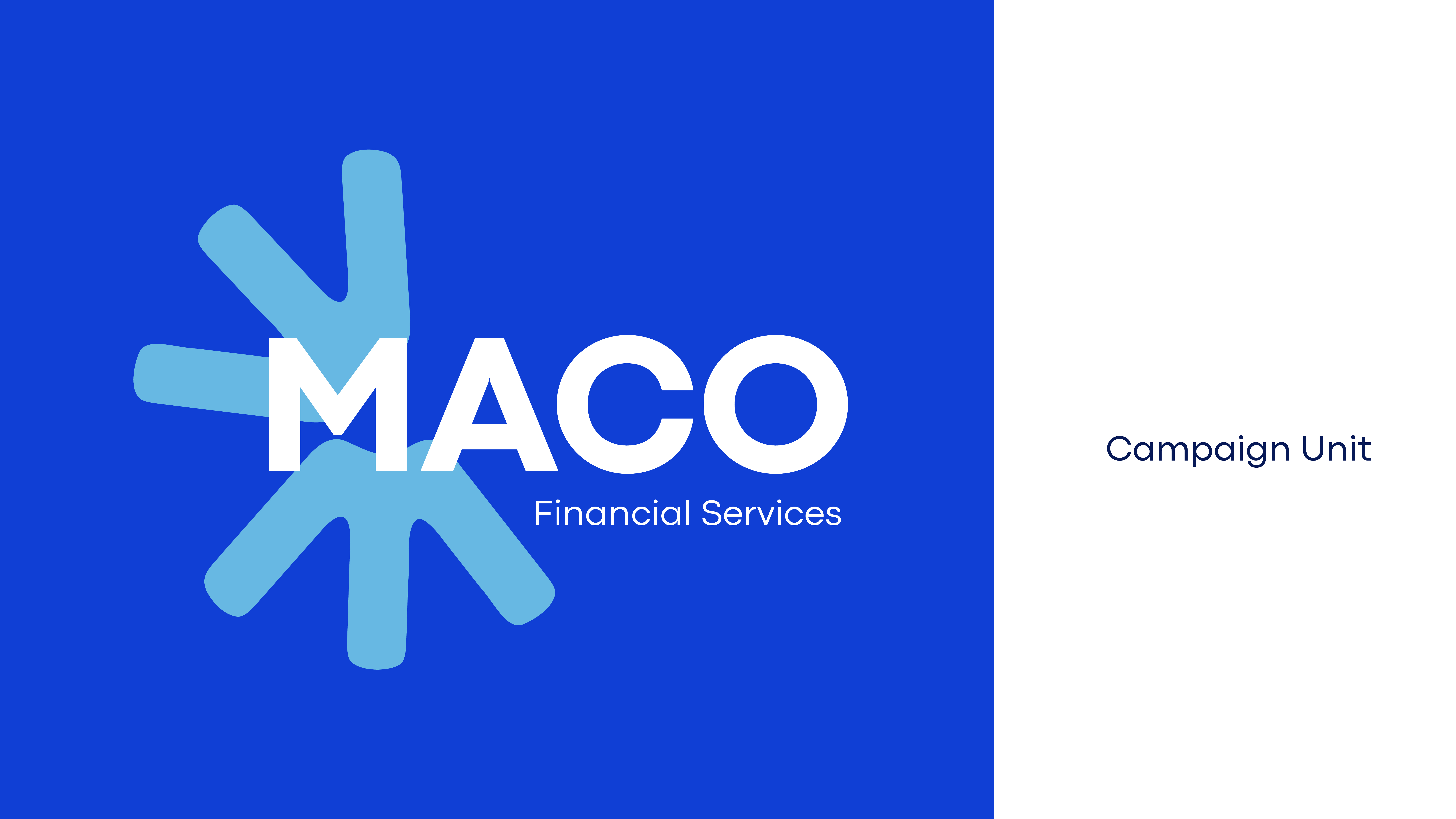
The idea came from letter M, tweaked and smoothed into a pattern I have created using Adobe Illustrator. Using the Gen AI in Adobe, I replicated the pattern into a logo symbol. Each strand depicts the sub-sectors inside the business firm.
From the Letter M, I created a Visual Design System using the Adobe AI pattern generator tool.


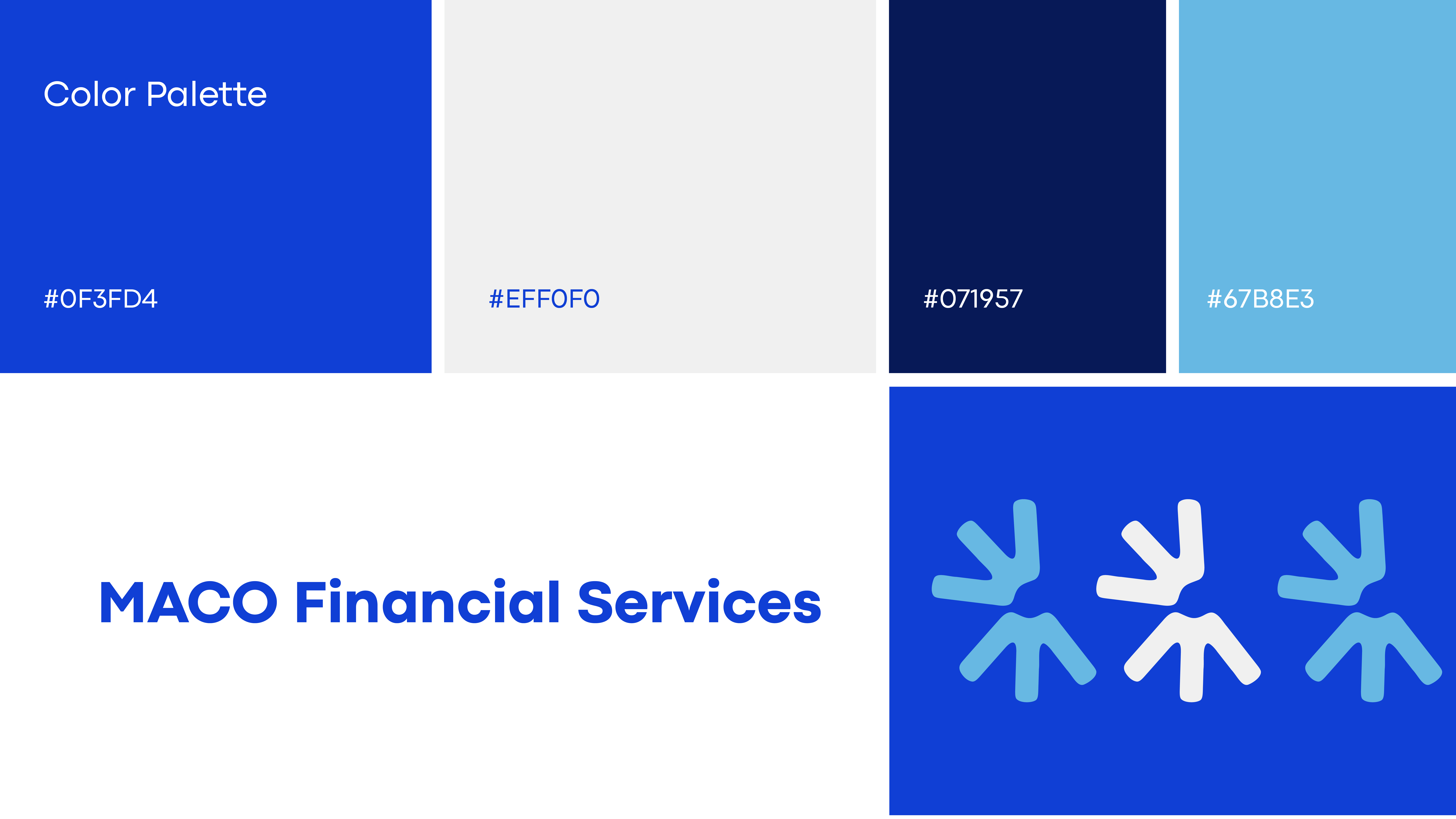
Primary and Secondary Colour Palette. This Bold Blue with Ivory white and a monotone of Blue is carefully selected, keeping in mind the firm is a Fin-Tech firm, and hence their presence needs to be bold yet intentional across all the platforms.


The instances/icons are created using the same design language with the main letter “M” and rectangular shapes. The colour palette is contrasting and suitable for the sub-sectors inside MACO Financial Services.
The symbols are quirky and easily moldable for any digital or print showcase.


The project became a success, and surprisingly, without any major iterations, the brand identity has been adapted by the firm.
This case study taught me one important thing about design: Corporate does not have to be COLD, BORING and OLD. A designer’s idea mixed with their ideology can create an impactful brand identity that stands with time.
